I started blogging in May and just jumped right into it.
After reading and becoming inspired by design blogs
I wanted my own forum for expression.
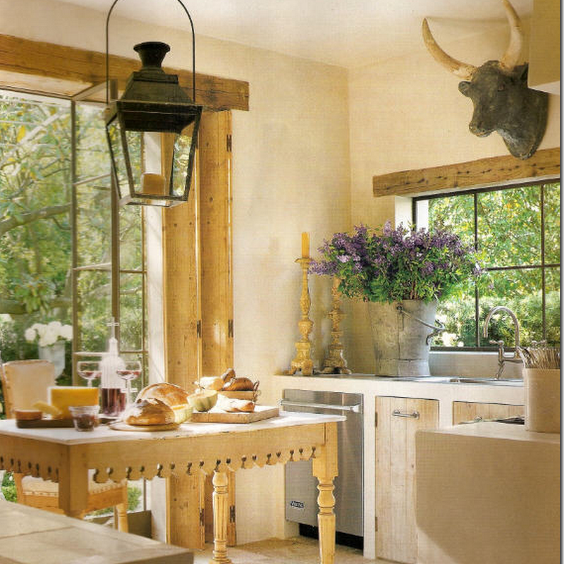
My header was a picture of a kitchen that captivated me.
After I got up and running I knew I wanted to come up
with a header that was original.
But I have so many interests~~
how could I convey them in one picture?
I put together a collage of nine pictures.
I got feedback saying it was too big.
I trimmed it down to two rows and
filled it with original Maison Decor pics.
I used the blogger text of Maison Decor above the grid.
This is what is currently in place.
However, I also wanted to try making a sketch for
my header and this is what I came up with.
I combined a few pics collage style underneath
it and ran text through the middle.
This is a sketch of a dream house I conjured up.
Should I have only the house sketch with lettering?
What color text is best?
So now I am asking you which you prefer?
I am not averse to switching things around
or heading back to the drawing board!
Any suggestions or preferences?
An update:
I decided to use a mosaic or collage of 8 pictures that will change on a monthly or seasonal basis. That way I can update with new things I have found or projects I have made or things that inspire.
One idea I will be doing is a color scheme collage based on one color group.
As all things in design, I know that it will be changing!


.jpg)
+.jpg)


No comments:
Post a Comment